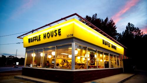
Q: With the recent passing of Waffle House co-founder Joe Rogers Sr., did he design each restaurant to be a rectangle so it would be like a rectangle in an actual waffle? They appear to have similar dimensions.
—Don White, Atlanta
A: Which came first, the waffle or the house?
When Joe Rogers Sr. and Tom Forkner opened the first Waffle House in 1955 in Avondale Estates, the original building was not a standalone restaurant. The first restaurant was connected to another building, so from the outside, it doesn’t look like today’s Waffle House, said Pat Warner, a Waffle House spokesman.
The typical Waffle House does have a boxy look, which was referred to as a “shoebox” design, said Warner. The design was inspired by local commercial real estate ordinances in the 1960s that based land costs and taxes on how much of the storefront faced the road, not on total square footage.
“[The founders and designers] went with a shoebox design that turned, so we could get a more narrow lot,” Warner said.
The sixth Waffle House, which used a “shoebox” design by Paul Schulte, opened in November 1961 near Moreland and Glenwood avenues in Atlanta. Schulte’s designs were close to the look of the restaurants seen today, but with a pitched roof. Clifford Nahser, a Roswell architect, took over the designs, starting with the seventh Waffle House, in 1962 in East Point. It was with this unit that the shoebox and flat roof that has become associated with Waffle House took shape.
“The inside configures a little differently, depending on how many booths and counter seats,” Warner said. “We keep the small footprint to keep the grill out front for the experience. That’s a big part of the experience for customers, hearing their orders called out and seeing it cooked. It’s a main driving factor for not going to the bigger restaurant and for wanting to keep that smaller footprint.”
While the restaurant’s size has not changed much in the past 60 years, the logo has evolved from a script that originally looked like syrup, Warner said.
The block type didn’t come around until the early ‘60s, when the company began placing the logo on high rises near interstates and highways to attract travelers. The block type and tiles were distinctive and easy to see from the interstate.
As for the restaurant’s design inspiring the waffle’s design, Warner simply said the shape was “based on the commercial waffle irons in the ’50s and ‘60s. They then added the imprinted logos. They just liked that type of waffle, a traditional waffle.”
If you’re new in town or have questions about this special place we call home, ask us! Email q&a@ajc.com or call 404-222-2002.


